Logos
Jump to a Content Section:
Stacked Configuration
The function of the logo is to identify print pieces and digital media as being from Schoolcraft College. The logo is not intended to serve as the primary design element in a layout. And like the College Seal, the logo should not be used as a graphic element within a larger design. It should stand alone, serving as the College’s identifying mark.
Proper Logo Usage
- The logo may be reproduced in two colors, using blue and the gold in the bell tower icon. See example above.
- If you are printing/copying in black and white, do not use the two-color logo. Use the solid one-color version (see below).
- The one-color logo may be blue or black.

- May be reversed as white out of certain solid color backgrounds (blue, gold, white or black only). No other solid backgrounds are acceptable.

- The logo should not be reproduced in other colors.
- The logo should appear only once on a document page.
- Care should be given to ensure that the logo reproduces cleanly and crisply.
- Only use art provided by Marketing, which is available for download. Do not attempt to recreate the logo using an available version of Lucida Fax Demibold. Not all versions reproduce the same, and the use of other versions of the font is considered a violation of these guidelines.
Horizontal Configuration
Proper Logo Usage
There is another logo configuration, a horizontal version, that was created specifically to have greater flexibility in a variety of logo applications. The horizontal logo configurations should not be altered in any way. The goal is visual consistency in all logo applications.
- The logo may be reproduced in two colors, using blue and the gold in the bell tower icon. See example above.
- If you are printing/copying in black and white, do not use the two-color logo. Use the solid one-color version.
- The one-color logo may be black or blue.

Improper Logo Usage
 | The bell tower icon is not to appear separately from the name of the college without permission from the Marketing Department. |
 | Do not use color tints. |
 | Do not use anything other than the specified colors for reproducing the logo. |
 | Do not distort the logo horizontally. |
 | Do not distort the logo vertically. |
 | Do not obscure the logo with type or images. |
 | Gradations should not be used on the bell tower icon or the type. |
 | If you are printing in black and white, do not use the two-color logo. Use the solid one-color version. |
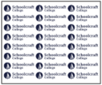 | Do not use the logo as a repeatable design element. |
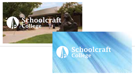 | Do not reverse the logo out of a photographic or an illustrated background. |
Clear Space around the Logo
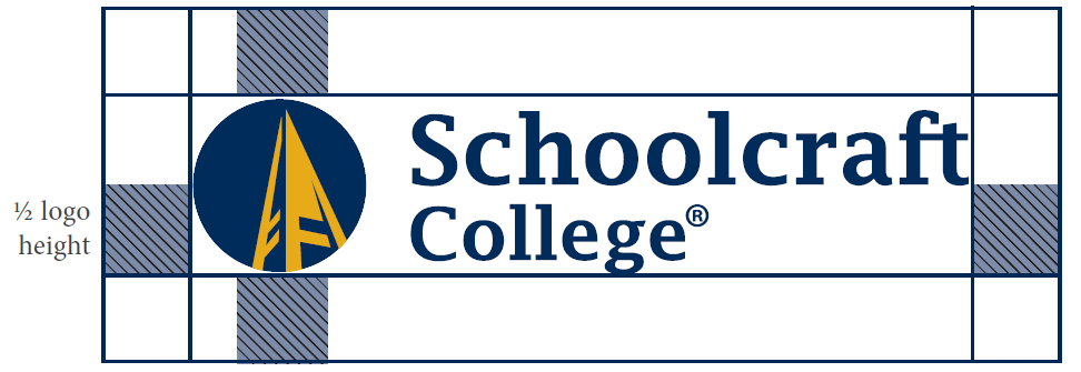
To create greater visual impact, keep the area around the Schoolcraft logo uncluttered. The minimum clear space around the logo should be equal to half the logo’s height.
Logo Assets
For Office Documents, Presentations and all Digital Uses
For Schoolcraft logo files, please contact [email protected].
